 Graphic 1:
Elements that could make a paper more convincing.
courtesy: Canadian Graphic Designers Association of Canada
by FRED CHARUNDER-MACHARRUNDEIRA, Alternate Reality News Service Science Writer
Okay. Your argument is more or less logical, with your points following each other in a way that is just about convincing. The facts you have marshalled aren't too out of date, and they pretty much support the argument you are making. You have kept the non-sequiturs to a minimum and your attempts at humour are almost pretty darn funny. Yet, despite all of your hard work, colleagues tell you that your paper just doesn't convince them. What should you do?
Add graphics. <.p>
"It's a well known fact," said Nick McVixen, Historian...of...SCIENCE! (da da da!), "that imperfect scholarship can be overcome by the clever use of graphics. Take Einstein's General Theory of Relativity. When it was first published, it was completely ignored by the physics community. Nothing. Nada. Bupkiss. You heard crickets every time anybody cracked it open, which wasn't often. Then, the Illustrated General Theory of Relativity came out, and it was a major hit with physicists and female English Lit majors."
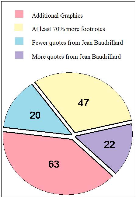
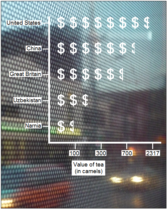
Nick McVixen pointed to research that showed conclusively that adding graphics to a research paper gave it more credibility than other forms of potential improvement (see Graphic 1).
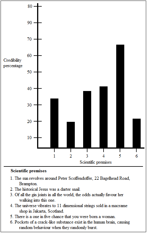
Graphic 1:"The persuasive power of graphics is unparalleled," agreed Vicki Rock-Dixon, PhD...candidate...IN...SCIENTISMICS! (da da da dum!) "Let's take a simple scientific premise: there is a one in five chance that you were born a woman. Now, a lot of ordinary people who have not been trained in the scientific method might scoff at this fact. It is, as they say, countertop-intuitive. However, if you put it in visual form (see Graphic 2), the underlying logic is revealed, making the conclusion unassailable!"
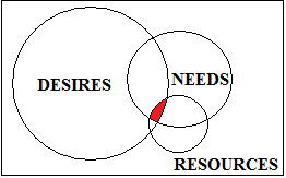
 Graphic 2:
The 800 pound, seven ounces gorilla of graphical information in the room is, of course, the Venn Diagram. "Any relationship of the least importance can be shown in a Venn Diagram," Nick McVixen stated.
"I dream of the perfect Venn diagram in my sleep," Vicki Rock-Dixon agreed.
"I wrote Venn Diagram in as my choice for MP in the last election," Nick McVixen one-upped Vicki Rock-Dixon.
"I dated a Venn diagram for six months," Vicki Rock-Dixon seven-upped Nick McVixen. "We would still be together, too, probably married by now, if a [EXPLETIVE DELETED] bar graph hadn't stolen it away from me!"
"Uhh, maybe it would be best if we went to Graphic 3," Nick McVixen, clearly uncomfortable with the hint of girl on graphic sex, suggested.
 Graphic 3:
Our experts were split on the efficacy of edutainment infographics. "I love eye-popping images melded with information, exactly like in Graphic 4," Vicki Rock-Dixon admitted. "In fact, I have a special pair of tweezers just for putting my eyes back in their sockets after they have popped out!"
 Graphic 4:
"While they can be eye-catching," Nick McVixen disagreed, "they can also distract from the actual information you want your reader to understand. If you have an infographic made up of three wise men, two robots that shoot red laser beams out of their eyes and a sperm whale named Duffy to look at, you aren't likely to appreciate that the information that the chart is trying to convey involves the size of a male hummingbird's testicles correlated overt time with the Dow Jones Industrial Average. Well, the size of a male hummingbird's testicles might get your attention."
To drive his point home, Nick McVixen found a simpler version of the chart in Graphic 4 that contained exactly the same information, but was displayed in what he insisted was a much easier way to understand (Graphic 5).
 Graphic 5:
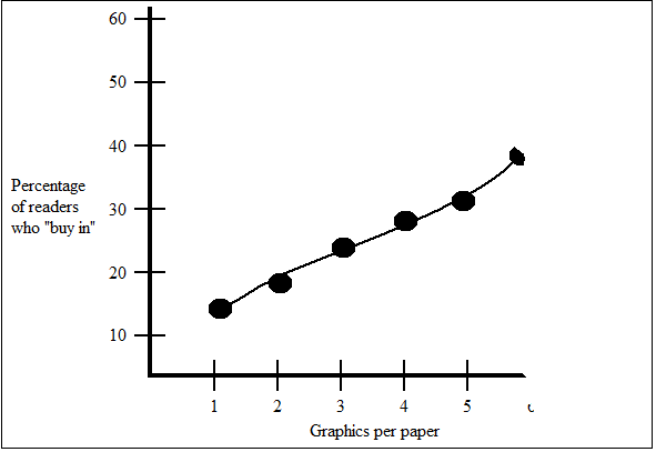
The experts also split on the optimum number of graphics per paper. Nick McVixen believed that there was no upper limit. "I once submitted a paper with 1,249 graphics to the Journal of Improbable Physeds," he crowed. "They serialized it over several years. I was hailed as the Dickens of digital imagery. It would have guaranteed me tenure at a mid-level university if I had remembered to get my application in by the deadline, but, let...let's not spoil my triumph with inconvenient truths..."
"Nick is a little behind the times," Vicki Rock-Dixon commented. "Recent research clearly shows that the optimum number of graphics per paper is 5.7. Adding more graphics beyond that actually decreases the possibility that a reader of the paper will buy into its conclusions."
"What recent research?" Nick McVixen challenged.
"The research summed up in Graphic 5.7," Vicki Rock-Dixon told him.
 Graphic 5.7:
"Ooh," Nick McVixen cooed. "A cool graphic. I guess I was wrong, then."
Vicki Rock-Dixon smiled smugly.